Building beautiful list views in Pulse

Introduction
You’ve seen the videos, you’ve read the press releases, but how do you actually pull together your own page on the Skedulo Pulse Platform? Come with me. I’m Alison, a solution architect here at Skedulo, and I have never been a person who codes. I have come from a pure declarative, clicks-not-code background, and I managed to make my first page in less than an afternoon.
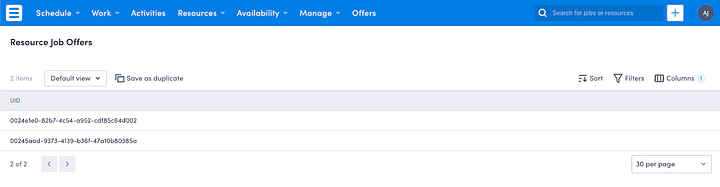
So where to begin? You’ve got your Skedulo tenant, and there’s a view you want to be able to see. For me, it was being able to visualise all Job Offers in a single page. Yes, they can go to see the offers for each Job on separate pages, but I wanted a single list, to allow schedulers to see what needs to be chased up.
To begin, I wanted to see the list view that would be in the system by default. Here’s what we get:
To make changes to the default, I went to the Settings section of my Skedulo instance. From here I navigated to the Data Objects menu on the left.
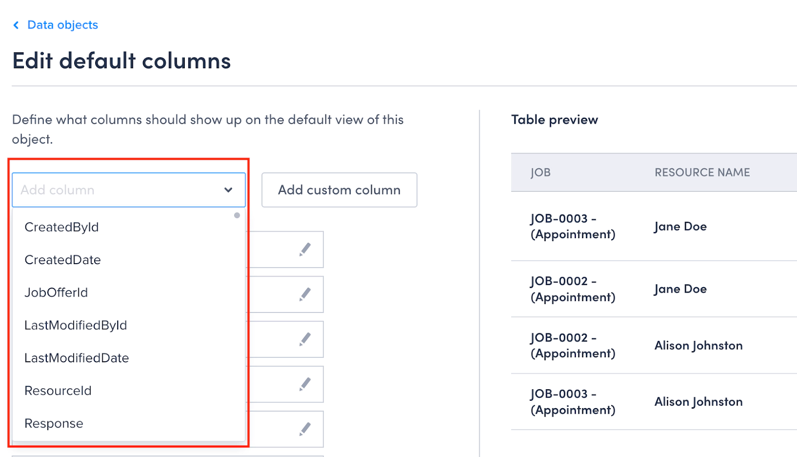
I found the Resource Job Offers object by searching for it using the search bar on the right. Clicking on the action icon, I can then Edit the object which gives me a way to add extra fields if I need them. I just wanted to pick which fields would show in a list view, so I went straight to Edit default columns.
Information, but make it helpful
Adding columns is easy — select the field you want and it appears in the preview, and in this instance, we will absolutely want to add some additional Job Offer attributes such as the Job it relates to and who the offer was sent to. Without the additional fields exposed as columns, the user would only see the record ID which is not likely to get them very far. Enter the Skedulo Support library of handy hints! I went to the Advanced column configuration for list views page and thought that I could follow this.
Let’s see how I went, shall we?
I removed the UID of the Job Offer, as it didn’t really help the end user to know the ID of the specific record. Thinking through what would be useful, I chose the Job, the names of who received the offers, the status of both the offer and Job, and a few other bits and pieces.
So, using the Add Column drop down, I could find the Job ID.
Great! Let’s pop that in. But showing the ID to the user isn’t super helpful, so I thought the Job Number & Job Type would be the most effective visual. So I edited the Column, and put in
<sp-link href=”/job/{{JobOffer.JobId}}”><b>{{JobOffer.Job.Name}}</b> — ({{JobOffer.Job.Type}})</sp-link>
But wait! You said you didn’t code! (Or use markup, technically) You are correct dear reader. I am however very good at copy & paste! In the help article, there is a section on concatenation as well as a section on using hyperlinks, which uses the exact code above. I just put the two bits together, and now my Job Number looks like this:
JOB-1234 — (Appointment)
Next up was, who the Offer had been sent to (i.e. the Resources). Again, showing the UIDs of these records is not helpful at all to an end user. Resources definitely have names, so some quick updates to the column template gave me the Name of the resource:
{{ Resource.Name }}
But, wouldn’t a user want to click through to the actual record from the list I wondered? And sure enough, using my trusty help article, I figured I could use the same snippet of code above, but swap out the objects.
<sp-link href=”/resources/{{Resource.UID}}”>{{Resource.Name}}</sp-link>
Now my Resource column gives me the name of the Resource, and a handy link to get to their record if I need it:
Jane Doe
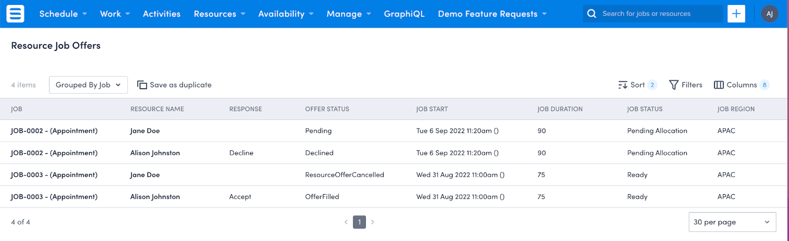
After that I added the following columns, figuring it would help a scheduler know what to chase up:
- The Resource Response to each offer
- The Offer status
- Job Estimated Start Date & Time
- Job Duration
- Job Status
- Job Region
A few more changes were done to refine the presentation of my data. I updated the format of the Estimated Start Date, again using our trusty help article (another copy & paste effort).
{{ JobOffer.Job.EstimatedStart | date(“ddd D MMM YYYY h:mm”) }}
Adding the Region Name requires a special trick that I shall unveil for you right before your very eyes. By default, attributes on the current object plus one object away (e.g. Job Offer and Job) are displayed in the column drop-down, but as soon as we set our column template to require region attributes (3 steps away) by using the below template when the page is refreshed we will have access to all the region attributes as well. Impressive huh? Using the same logic as the above snippet for getting the Job Name, I entered the below to show the name of the region, not the UID.
{{ JobOffer.Job.Region.Name }}
Now my page looks helpful with the information I think people need.
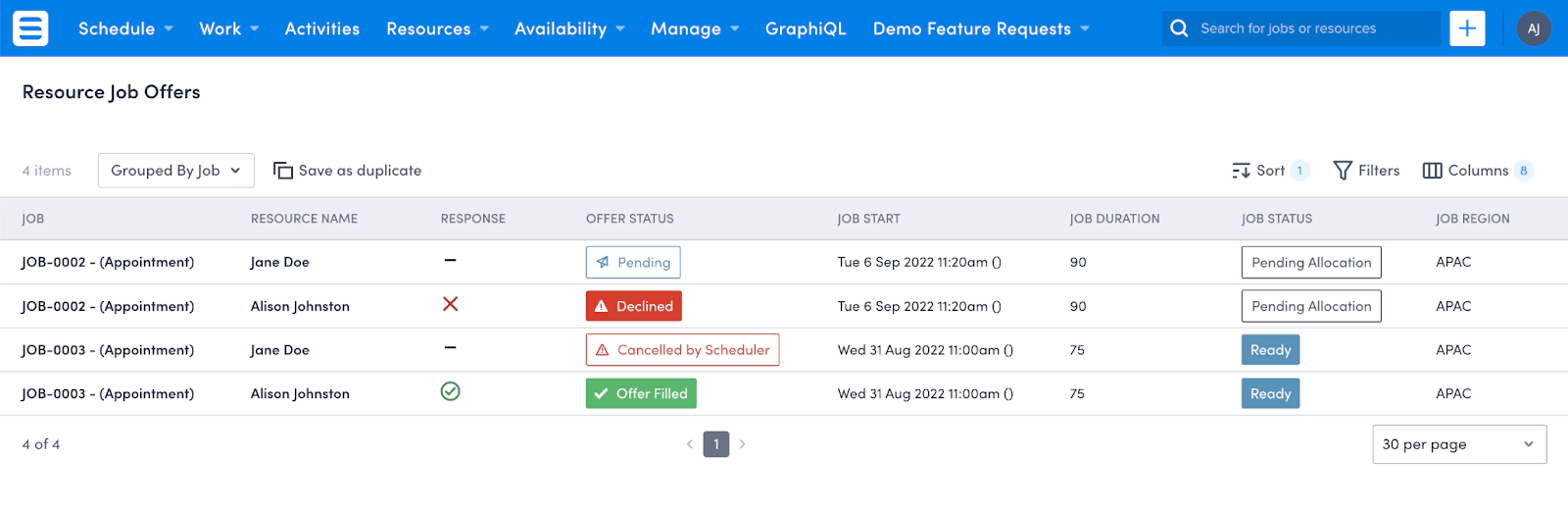
Information, but make it pretty
Last but not least, I wanted to have some colour and images to engage the users more. Our trusty help article talks about icons and colours. I was onto a winner! The hardest part was picking which icon to use!
But before we pick an icon, let’s figure out what we’re trying to show. For the Resource response to an offer, there’s 3 options: Accept, Decline or Pending. This seemed like a good use for an icon, instead of words. So I grabbed the snippet from the help article
{% if status == “Paid” %} {# replace Paid with your value #}
<sp-lozenge leading-icon=”tick”>{{status}}</sp-lozenge>
{% elseif status == “Sent” %} *{# replace Sent with your value #}
<sp-lozenge leading-icon=”notify”>{{status}}</sp-lozenge>
{% elseif status == “Overdue” %} *{# replace Overdue with your value #}
<sp-lozenge leading-icon=”warning”>{{status}}</sp-lozenge>
{% else %} {{ status }}
{% endif %}
- I swapped status for Response (and updated the values to the ones listed above)
- I swapped the tick for tickCircle
- I swapped the notify icon for close
- I swapped the warning icon for zoomOut.
It looked good. But I wanted colour! It was all so, well… grey. Back to our trusty help article and I found the colours section! The rest was just playing around with colours and shades until I was happy. Green tick in a circle. Looks good, don’t you think? (see screenshot below)
{% if Response == “Accept” %}
<div style=”color:var(—sp-color-green-800);”>
<sp-icon icon=”tickCircle”></sp-icon></div>
 {% elseif Response == “Decline” %}
<div style=”color:var(—sp-color-red-800);”>
<sp-icon icon=”close”></sp-icon></div>
{% else %}
<sp-icon icon=”zoomOut”></sp-icon>
{% endif %}
I played around with the Offer Status and the Job Status as well, just to give a bit more oomph to my page.
Again, a copy & paste exercise from our trusty help article, and a few tweaks got me both icons and colours for the Offer status. I also swapped out the wording of the status for OfferFilled and ResourceOfferCancelled with something a bit more user friendly, using the quotation marks to make sure the words rendered properly.
{% if Status == “OfferFilled” %}
<sp-lozenge leading-icon=”tick” theme=”solid” color=”green”>”Offer Filled”</sp-lozenge>
{% elseif Status == “Pending” %}
<sp-lozenge leading-icon=”notify” theme =”border” color=”sapphire”>{{Status}}</sp-lozenge>
{% elseif Status == “ResourceOfferCancelled” %}
<sp-lozenge leading-icon=”warning” theme =”border” color=”red”>”Cancelled by Scheduler”</sp-lozenge>
{% elseif Status == “Declined” %}
<sp-lozenge leading-icon=”warningFill” theme =”solid” color=”red”>{{Status}}</sp-lozenge>
{% else %} {{ Status }}
{% endif %}
Job Status was more of the same, but without the icons (I didn’t want too much clutter).
{% if JobOffer.Job.JobStatus == “Queued” %}
  <sp-lozenge theme=”border” color=”neutral”>{{JobOffer.Job.JobStatus}}</sp-lozenge>
{% elseif JobOffer.Job.JobStatus == “Pending Allocation” %}
  <sp-lozenge theme =”border” color=”neutral”>{{JobOffer.Job.JobStatus}}</sp-lozenge>
{% elseif JobOffer.Job.JobStatus == “Pending Dispatch” %}
  <sp-lozenge theme =”border” color=”sapphire”>{{JobOffer.Job.JobStatus}}</sp-lozenge>
{% elseif JobOffer.Job.JobStatus == “Dispatched” %}
  <sp-lozenge theme =”solid” color=”sapphire”>{{JobOffer.Job.JobStatus}}</sp-lozenge>
{% elseif JobOffer.Job.JobStatus == “Ready” %}
  <sp-lozenge theme =”solid” color=”sapphire”>{{JobOffer.Job.JobStatus}}</sp-lozenge>
{% elseif JobOffer.Job.JobStatus == “En Route” %}
  <sp-lozenge theme =”solid” color=”purple”>{{JobOffer.Job.JobStatus}}</sp-lozenge>
{% elseif JobOffer.Job.JobStatus == “On Site” %}
  <sp-lozenge theme =”solid” color=”purple”>{{JobOffer.Job.JobStatus}}</sp-lozenge>
{% elseif JobOffer.Job.JobStatus == “In Progress” %}
  <sp-lozenge theme =”solid” color=”purple”>{{JobOffer.Job.JobStatus}}</sp-lozenge>
{% elseif JobOffer.Job.JobStatus == “Complete” %}
  <sp-lozenge theme =”solid” color=”green”>{{JobOffer.Job.JobStatus}}</sp-lozenge>
{% elseif JobOffer.Job.JobStatus == “Cancelled” %}
  <sp-lozenge theme =”solid” color=”Red”>{{JobOffer.Job.JobStatus}}</sp-lozenge>
{% else %}
  {{ status }}
{% endif %}
Here’s my final page:
Information for the people
We are almost there! All I needed now was a way to give this fancy new view to my users. Off to the Global Navigation Bar we go!
Because Job Offers are part of the core Skedulo offering, I knew the list view would exist already, so it was just a matter of adding it to a menu somewhere.
First, I wanted to Add Menu Item. I gave it a name, and then I wanted to make sure I was pointing to the platform page for resource-job-offers. So, selecting Platform Page as the Type, I could find the correct page from the drop down. Reorder the menu and I was done! All my users now have access to a list view of all Job Offers! And no actual coding from scratch — a bit of copy and paste, but if I can do it, anyone can!